NOTE: From any of the other Analytics pages, you can navigate to the Explorer tool and retain the current filter settings. This provides in depth views into any aspect of an app’s data.
Analytics Interface
- Log in to Free App Analytics.
- Select the desired Account and App.
- Select Analytics > Explorer.
Analytics Page Tools
For more information about the tools that can be used on the Analytics page such as date range, filters, sharing the page and exporting device ID, refer to our Analytics Page Tools support documentation.
Explorer Chart Overview
The Explorer chart is divided into 2 main sections, the Dimensions and Metrics selection areas, and the interactive chart.
Dimensions and Metrics can be added, removed and reordered as needed.
Mousing over Dimensions displays the expand button. By clicking on the Dimension expand button, specific level data can be displayed.
NOTE: When leveraging Cross App functionality, Explorer data for all apps within the App Name filter will be displayed. Explorer data may be displayed for each app by utilizing the dimensions feature. For more information on viewing Explorer data by app, refer to the Explorer Organization section.
NOTE: Only the first 250 rows will be displayed for the highest level dimension defined within the view. Adding a highest level dimension with over 250 unique combinations can produce varying results depending on dimension order.
NOTE: Analytics Explorer surfaces revenue sent on revenue event payloads.
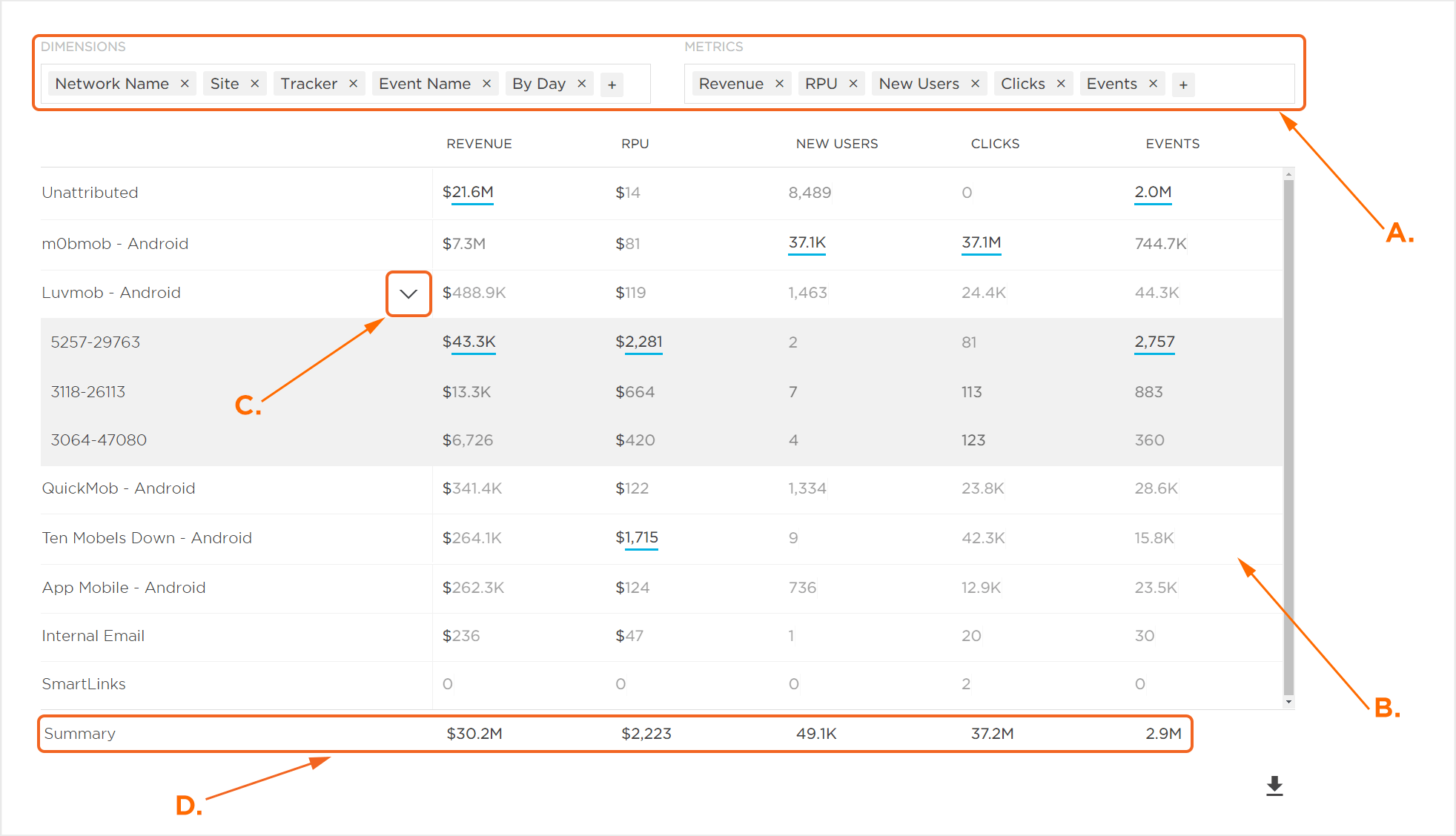
A. Dimensions and Metrics can be updated and organized as needed
B. Chart displaying selected Dimensions and Metrics
C. Dimension expand button.
D. Summary values are a sum of each row in the Metrics column. The only exception(s) to this are the RPU and RPI Metrics in which Kochava takes an average of the column.
Explorer Organization
Explorer data can be organized in many different ways in order to assist in the optimization of data visualization.
NOTE: The dimensions available is dependent on the data that is being sent to Free App Analytics.
- Within the Dimensions section, Click the “+” icon and Select one of the following:
- App ID
- App Name
- App Version
- Campaign
- Creative
- Segment
- Tracker
- Device Carrier Name
- Device Language
- Device Network Conn Type
- Device Orientation
- Device Os
- Device Os Version
- Device Type
- Device Version
- Ad Size
- Ad Type
- Churn Liklihood
- Churn Score
- Currency
- Friends Invited
- Items in Cart
- Mtr Rejected
- Data
- Device Type
- Placement
- Product Brand
- Product Name
- Product Sku
- Product Style
- Push Campaign
- Push Segment
- Receipt Status
- Revenue
- Session Duration
- Subscription Action
- Sum
- Total Sessions
- User Id
- User Total Revenue To Date
- Event Name
- City
- Country
- DMA
- Region
- Zip
- Type
- Install Campaign
- Install Creative
- Install Matched By
- Install Network Name
- Install Site
- Install Tracker
- Matched To
- Matched By
- Network Name
- Network Id
- Network Key
- Partner Ad Group Id
- Partner Ad Group Name
- Partner Campaign Id
- Partner Campaign Name
- Partner Keyword
- Partner Platform
- QR Code
- Site
- Agency Name
- Agency Id
- Traffic Verification Fail Reason
- Traffic Verified
- By Hour
- By Day
- By Week
- By Month
- Within the Metrics section, Click the “+” icon and Select one of the following:
- Events
- Clicks
- New Users
- Cost
- ROI
- RPU
- Revenue
- Cohort Installs
- LTV
- RPI
- New Users Attr
- Users
- CVR
- Impressions
- Sessions
- Average Session Count
- Average Session Time
- Events per User
- Total
- Search
- Events per User
- Total Users
- Ad View
- Purchase
- Push Opened
- Rating
- Logout
- Invite Friend
- Login
- Uninstall
- Subscribe
- Register
- Custom events being sent to the app
NOTE: For more information about how the Partner fields map to SAN metadata, please refer to our SAN Networks Campaign Data Mapping support documentation.
NOTE: By default, Campaign, Segment, Tracker, Event Name and By Day Dimensions are displayed.
NOTE: In order to use the App dimension feature (App ID, App Name, App Version), the desired corresponding apps must be added utilizing the filter feature. For more information about adding apps using the filter feature, refer to our Analytics Page Tools support documentation.
NOTE: The metrics available is dependent on the data that is being sent to Kochava.
NOTE: By default, Users, Events, Revenue, RPU, and Average Session Time Metrics are displayed.
NOTE: (Distinct) Metrics limit the associated event to display only the initial occurrence of a device ID for the given date range.
Specific Dimensions and Metrics can be removed by Clicking on the “X”.
Dimensions and/or Metrics can also be reordered by dragging and dropping the Dimensions and/or Metrics into any desired order. Once Dimensions and/or Metrics have been reordered, the interactive chart will be updated to reflect the change.
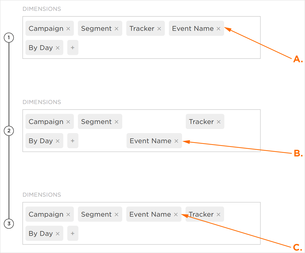
A. Original Configuration
B. Drag and Drop to reorder
C. New Configuration
Predicted Churn
Churn is the rate at which customers install an app and shortly afterwards abandoned the usage of the app. Churn rate is often used as an indicator of the health of an app’s user base. Kochava has created an algorithm that will score the likelihood to churn within only seven days providing marketers the opportunity to mitigate churn or reengage with their retained users. Our machine learning models observe over 30 data points which can include standard post-install events, custom post-install events tracked by the advertiser, and derived/engineered features.
NOTE: By default, churn modeling is not enabled for an app. If churn modeling needs to be enabled, contact your Client Success Management team.
Churn Score:
The Churn Score is a numeric representation of the probability that the device will churn. The Churn Score is a number that is between 0 and 1, where the closer the score is to 1 the more likely the device is to churn.
Churn Likelihood:
Churn Likelihoods are categories of devices based on the likelihood to churn. The groups represent four ranges of churn scores and are based on a dynamic mid-point that has been optimized for each app/model.
- Low — A group of devices that has a very low risk of churning. On average, these devices will have a churn score between 0 and 0.25.
- Medium Low — A group of devices that have a moderately low risk of churning. On average, these devices typically have a churn score between 0.25 and 0.50.
- Medium High — A group of devices that have a moderately high risk of churning. On average, these devices typically have a churn score between 0.50 and 0.75.
- High — A group of devices that have the highest likelihood of churn. On average, these devices typically have a churn score of 0.75 or higher.
Analytics Explorer provides the most in-depth look into churn, completing the following steps provides the deepest look into churn:
- Click Add a Filter.
- Select Churn Likelihood.
- Add the desired Likelihood Levels:
- Low — A group of devices that has a very low risk of churning. On average, these devices will have a churn score between 0 and 0.25.
- Medium Low — A group of devices that have a moderately low risk of churning. On average, these devices typically have a churn score between 0.25 and 0.50.
- Medium High — A group of devices that have a moderately high risk of churning. On average, these devices typically have a churn score between 0.50 and 0.75.
- High — A group of devices that have the highest likelihood of churn. On average, these devices typically have a churn score of 0.75 or higher.
BEST PRACTICES: Kochava recommends that the focus should be on the higher levels of churn. Focus mainly on the High, Medium High and possibly the Medium Low levels of churn. - Remove Dimensions, except for Network Name.
- Add Dimensions>Churn Likelihood
- Expand the desired Network to view the associated churn data.
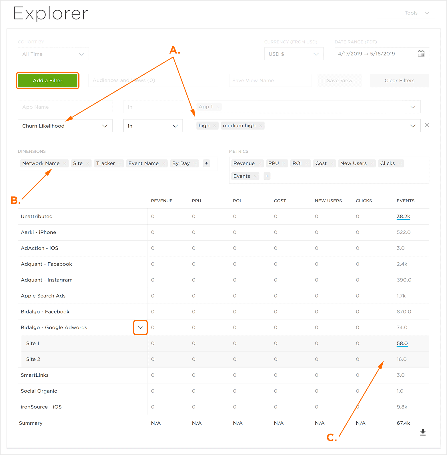
A. Add a Churn Likelihood filter.
B. Add the Churn Likelihood Dimension and remove other Dimensions except for Network Name.
C. Churn Likelihood Data.
NOTE: The device IDs associated with the higher levels of churn may be exported or saved as an audience for reengagment or push campaigns. For more information about exporting device IDs, refer to our Analytics Page Tools support documentation.
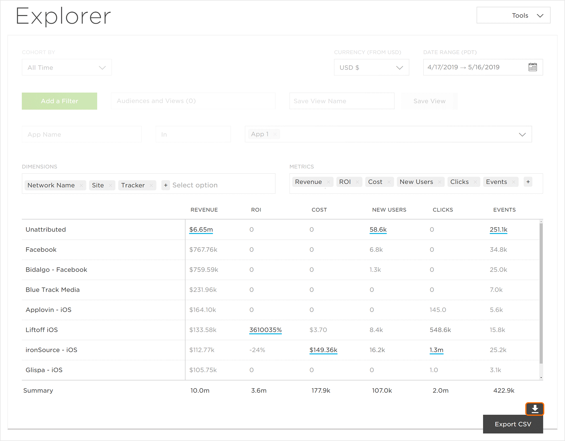
Exporting the Explorer Data
The data displayed within the Explorer chart can be exported in CSV format.
NOTE: Only the highest dimension selected will be displayed as part of the export.