Analytics Interface
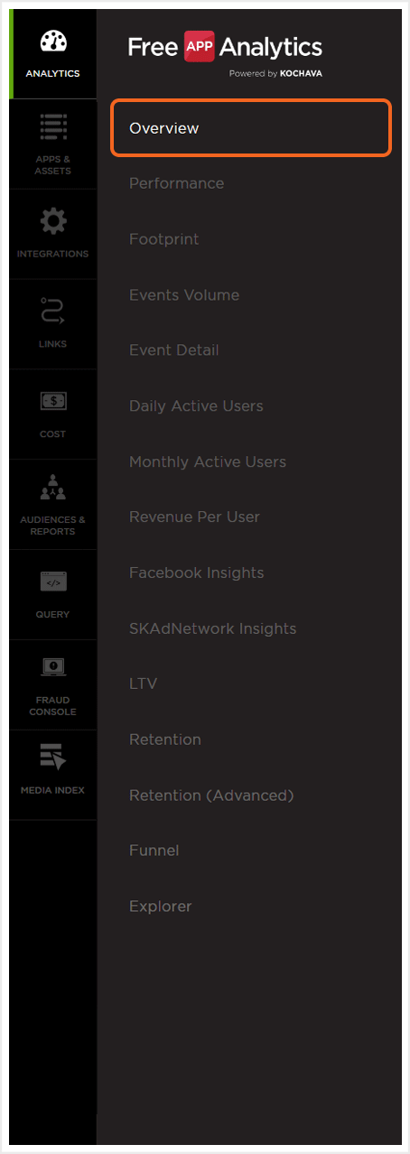
- Log in to Free App Analytics.
- Select the desired Account and App.
- Select Analytics > Overview.
Analytics Page Tools
For more information on the tools available for this Analytics page, such as the date field, exporting device IDs, sharing the page and applying cohorts and filters, refer to our Analytics Page Tools support documentation.
Analytics Overview Chart
The Analytics Overview chart is a representation of User Activity, Event Volume and Revenue associated to the app within the specified date range.
NOTE: When leveraging Cross App functionality User Activity, Event Volume and Revenue data for all apps within the App Name filter will be displayed. For more information about adding apps using the filter feature, refer to our Analytics Page Tools support documentation.
Users:
Displays New Users (the number of users who installed the app during the specified time range) and Total Users (the count of all distinct users who performed an event during the specified time period). Each of the sections may be selected to display within the graph and is represented by the blue line.
Event Volume:
Displays the Per User events and the Total number of events that occurred during the selected date range. Either of the sections may be selected to be displayed within the chart, and is represented by the green line.
Revenue:
Displays the Per User amounts and the Total amount purchased within the selected date range. Either of the sections may be selected to display within the chart and are represented by the yellow line.
Cost:
Displays the [itg-glossary glossary-id=”3493″]ROI[/itg-glossary] and the Total Cost of user acquisition during the selected date range. Either of the sections may be selected to display within the chart and are represented by the orange line.
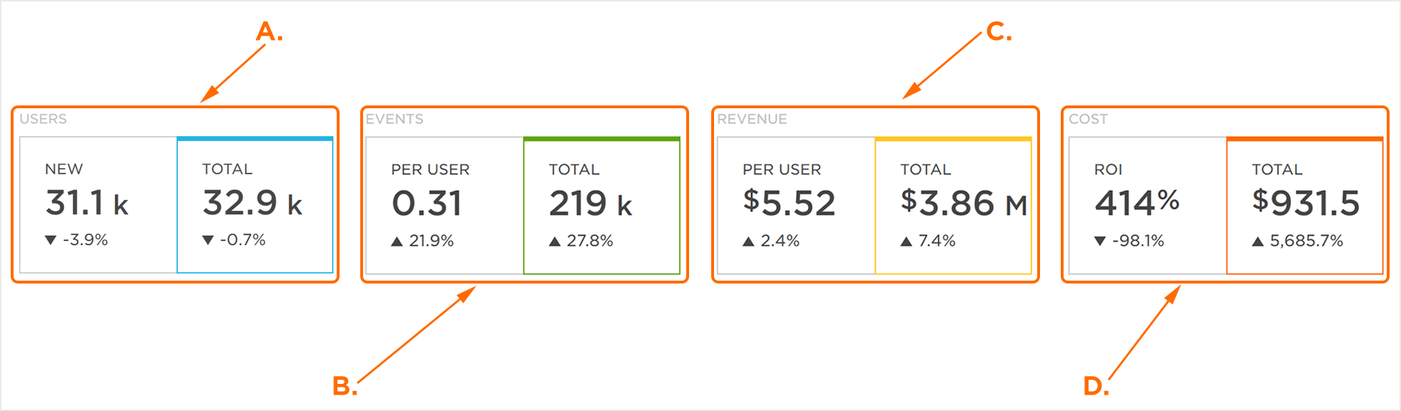
A. New: Users initial install within time frame. Total: All users performing an event within time frame.
B. Per User: Average number of events per user within time frame. Total: All events within time frame.
C. Per User: Average amount spent per user within time frame. Total: All revenue within time frame.
D. ROI: The percentage of return from monetary investment within time frame.
The Analytics Overview chart displays data associated with selections within the Users, Event Volume and Revenue categories; the graphical representation of the data updates in response to alternate selections within the Users, Event Volume and Revenue categories.
Each category (Users, Event Volume, Revenue and Cost) is represented on the interactive chart by a vertical axis which is color coded for easy identification. The horizontal axis represents the date range selected, and all totals are cumulative along the duration of the date range.
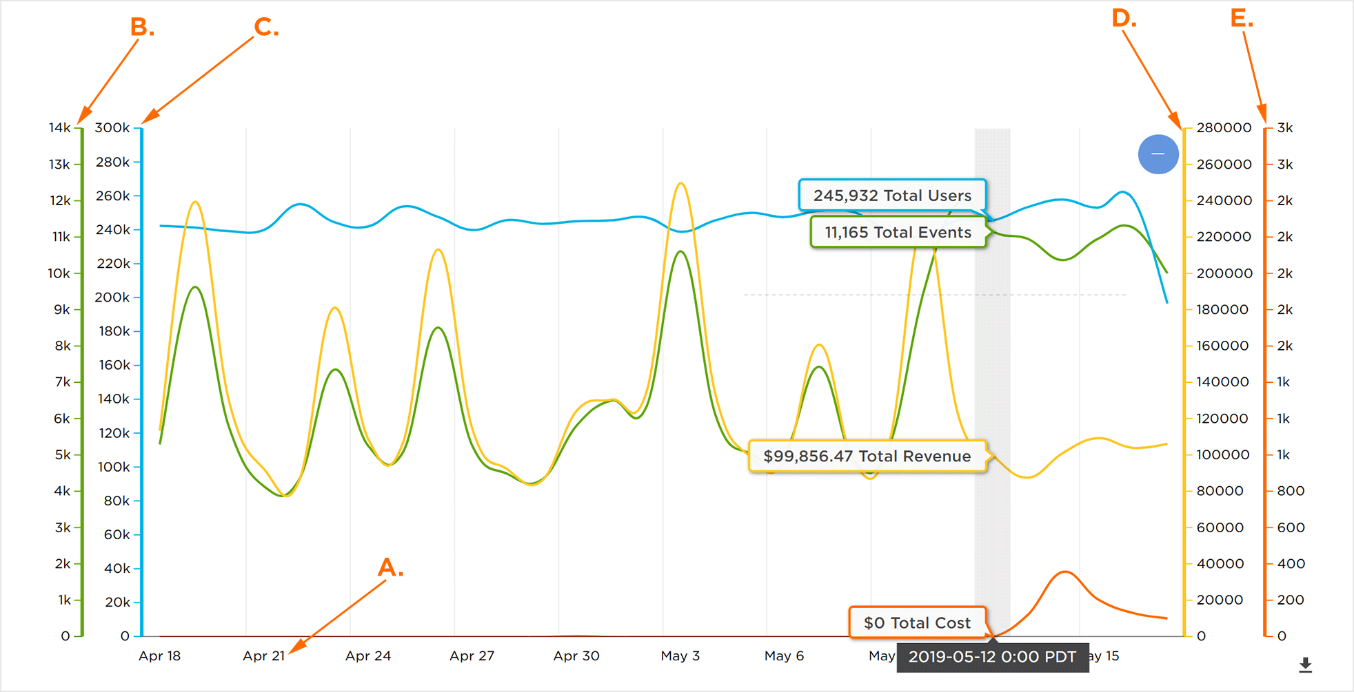
A. Horizontal Axis displaying time frame
B. Event Volume vertical axis
C. Users vertical axis
D. Revenue vertical axis
E. Cost vertical axis
Mousing over any part of the interactive chart will display the corresponding data for each category (Users, Event Volume, Revenue and Cost) for the corresponding date within the time frame. Moving the mouse along the horizontal axis will display the data for any of the dates within the selected time frame.
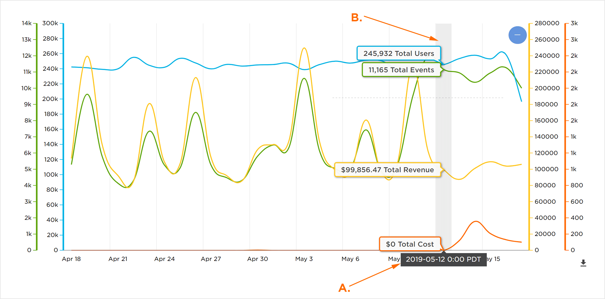
A. Current Highlighted Date
B. Users, Event Volume, Revenue, and Cost data for highlighted date
Changing the selections within the Users, Event Volume and Revenue categories will update any corresponding mouseover data within the interactive chart.
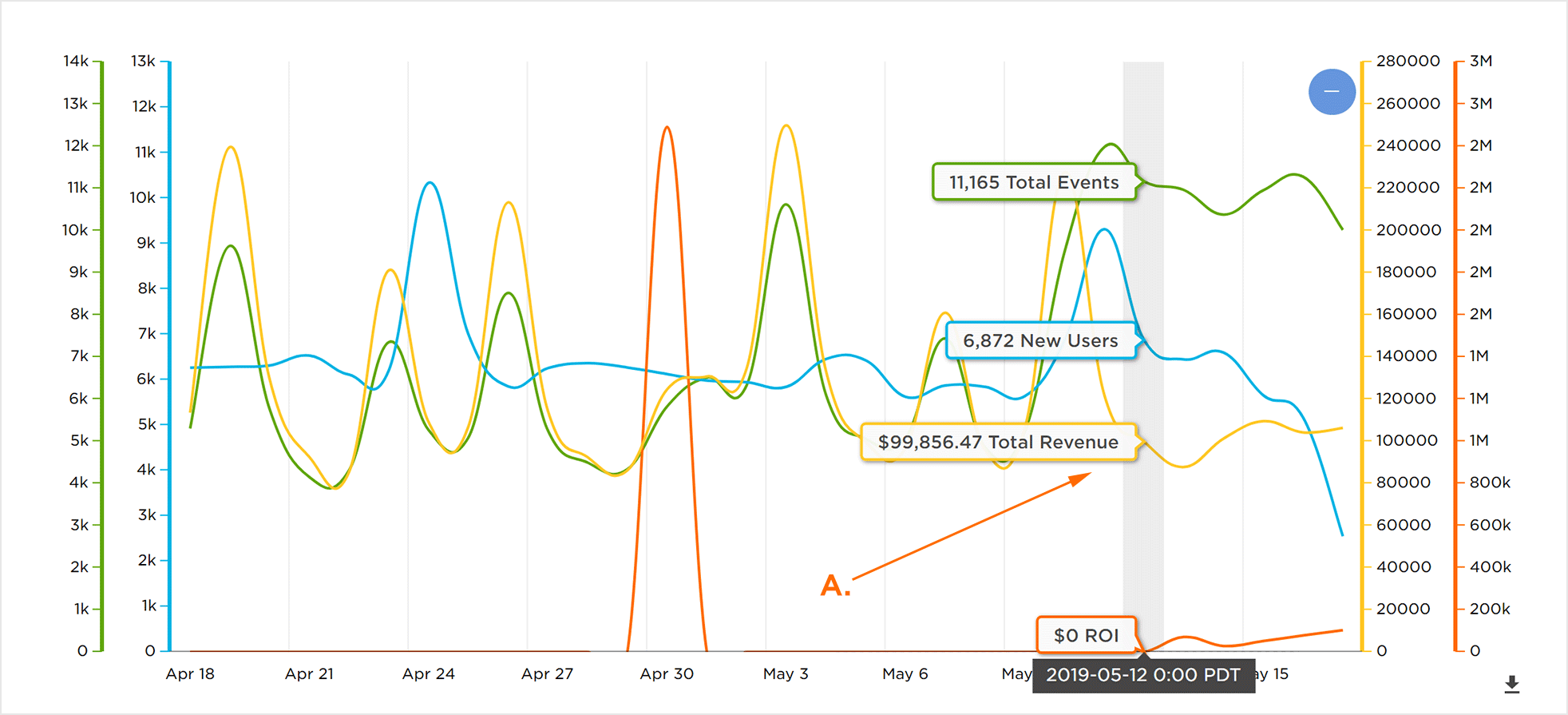
A. Mouseover data is updated to reflect the changed Users, Event Volume, Revenue and Cost selections
While mousing over the interactive chart Click, Hold and Drag to refine the date range.
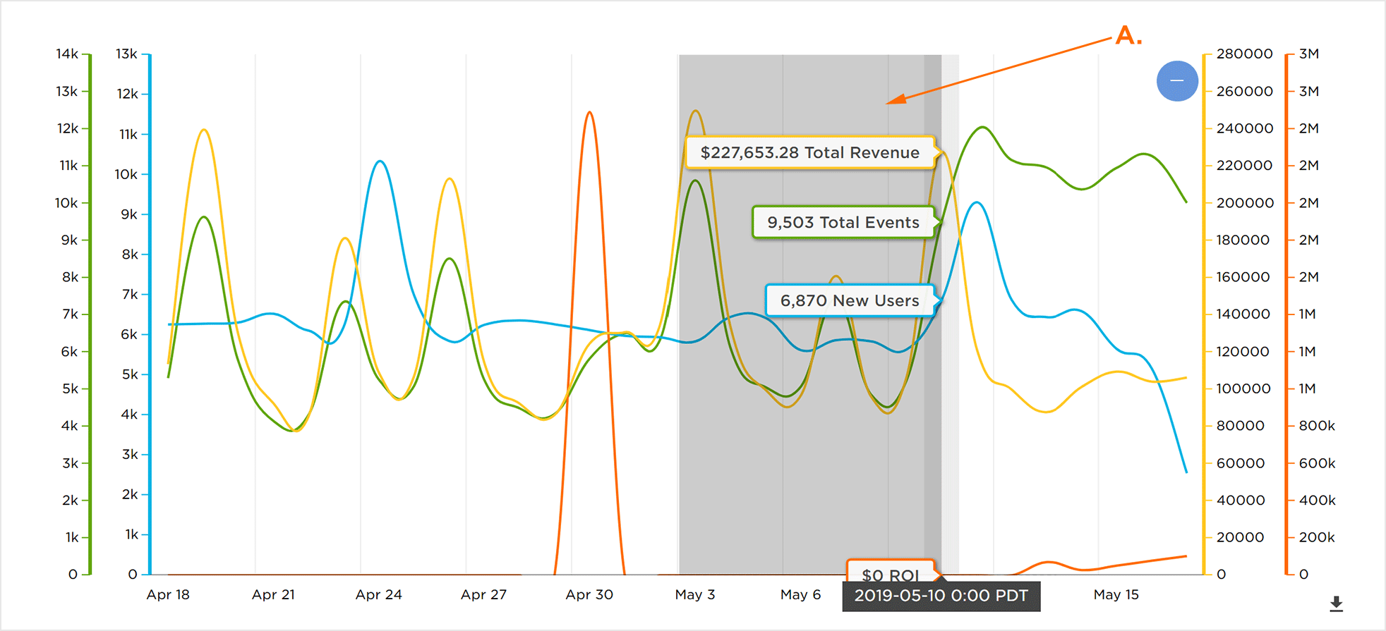
A. Click, hold and drag to expand a date range
Click – to return to the full date range.
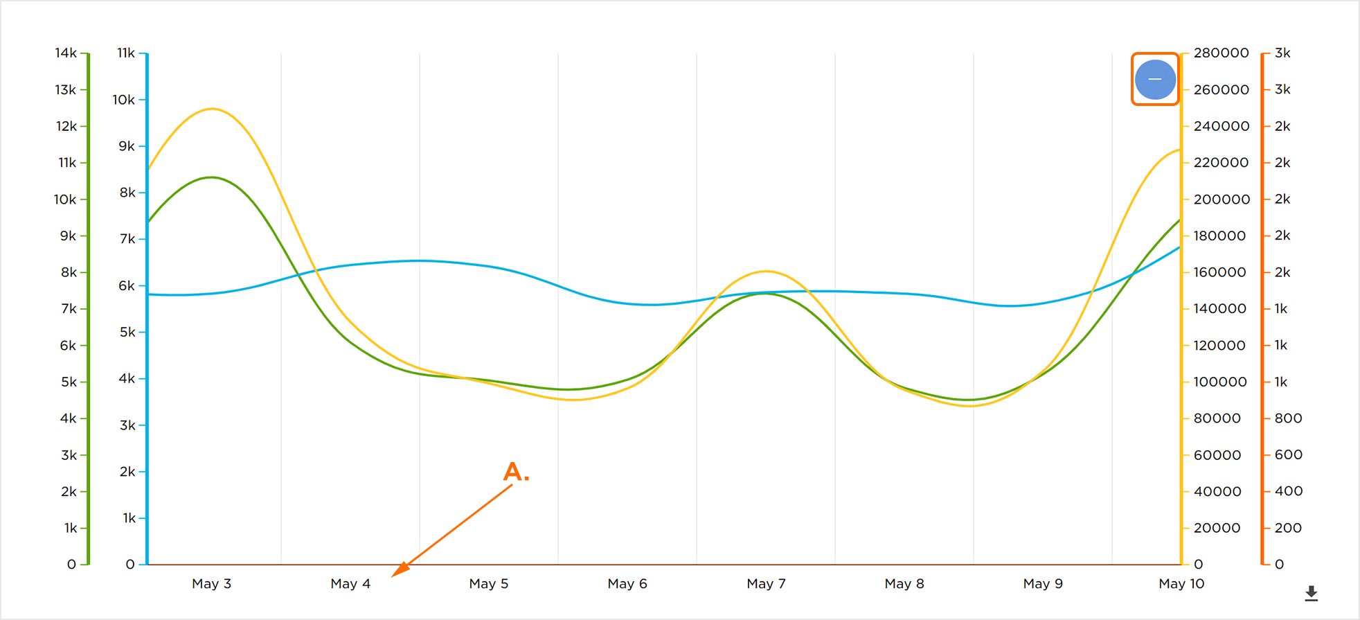
A. Refined date range
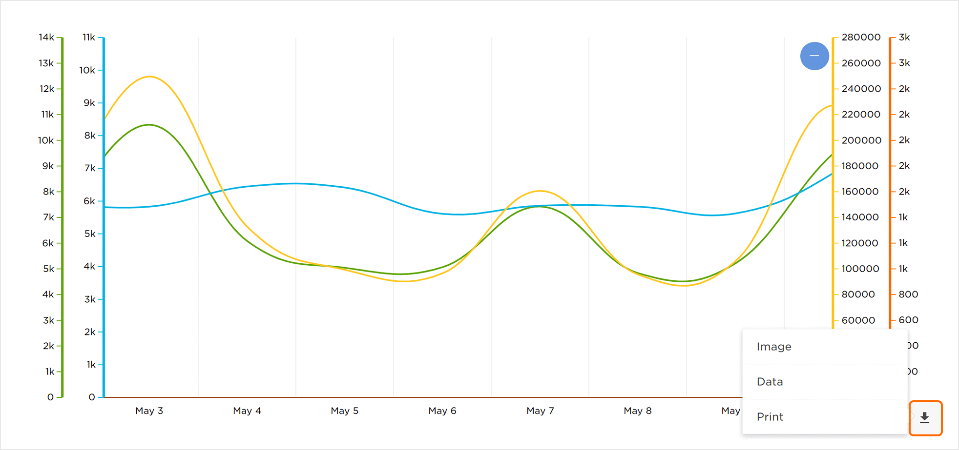
Downloading the Analytics Overview Chart Data
The data displayed within the Analytics Overview chart can be downloaded in the following formats:
Download Graphically:
Click the Download Button > Select Download Chart Image > Select a file format:
- PNG
- JPG
- SVG
Download Data:
Click the Download Button > Select Download Data > Select a file format.
- CSV
- XLSX
NOTE: When downloading a CSV, the daily numbers are distinct users for that day (ActiveUsers column), thus that column is not able to be summed given that the total is the count of distinct users in that app for the entire date range.
NOTE: If no events are being tracked in the app, but Free App Analytics is receiving installs or new users for the time range, the Active Users can be 0 or negative because of the estimation formula in DRUID.
Print Data:
Click the Download Button > Select Print.
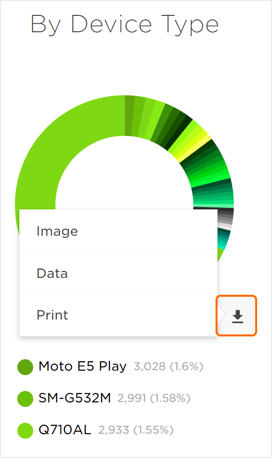
New Installs Donut Charts
The New Installs donut chart displays app installs by Network, Device Type, Device Version and OS Version. Data can be easily viewed within the charts by mousing over any of the individual sections. A display will appear detailing the Section Title, Section Total and Percentage of the total the section represents. Each section of data has been color coded for easy identification.
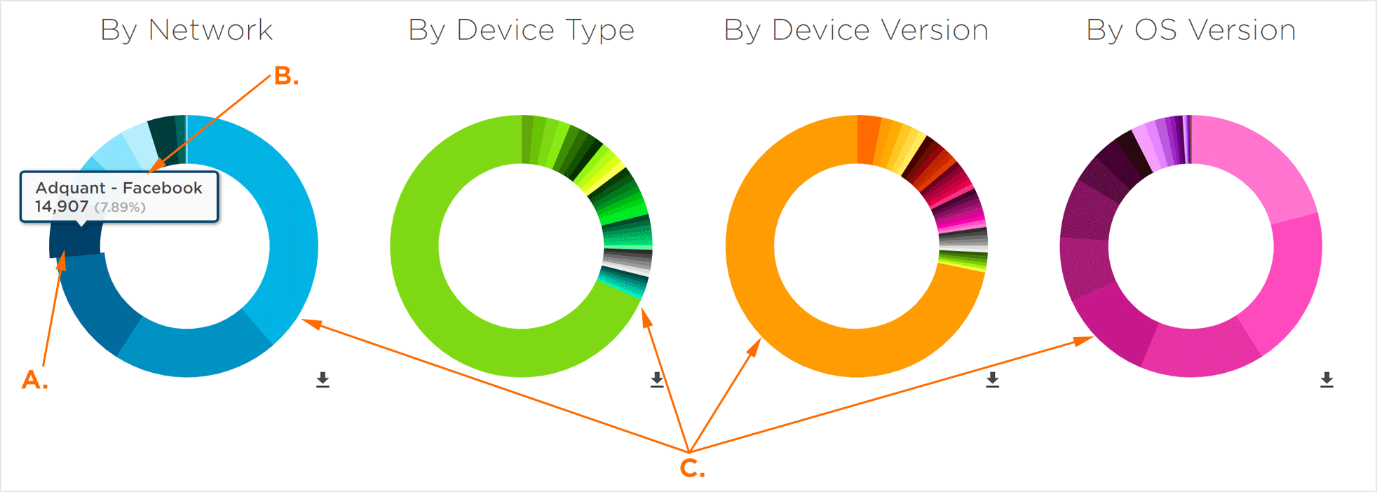
A. Mouseover to view associated data
B. Network: Facebook Total New Installs: 3,353 Percentage of New Installs: 0.42%
C. New Installs displayed by Network, Device Type and Device Version
Clicking on a section will pull that individual section apart from the chart, enabling easy analysis and comparison to other sections.
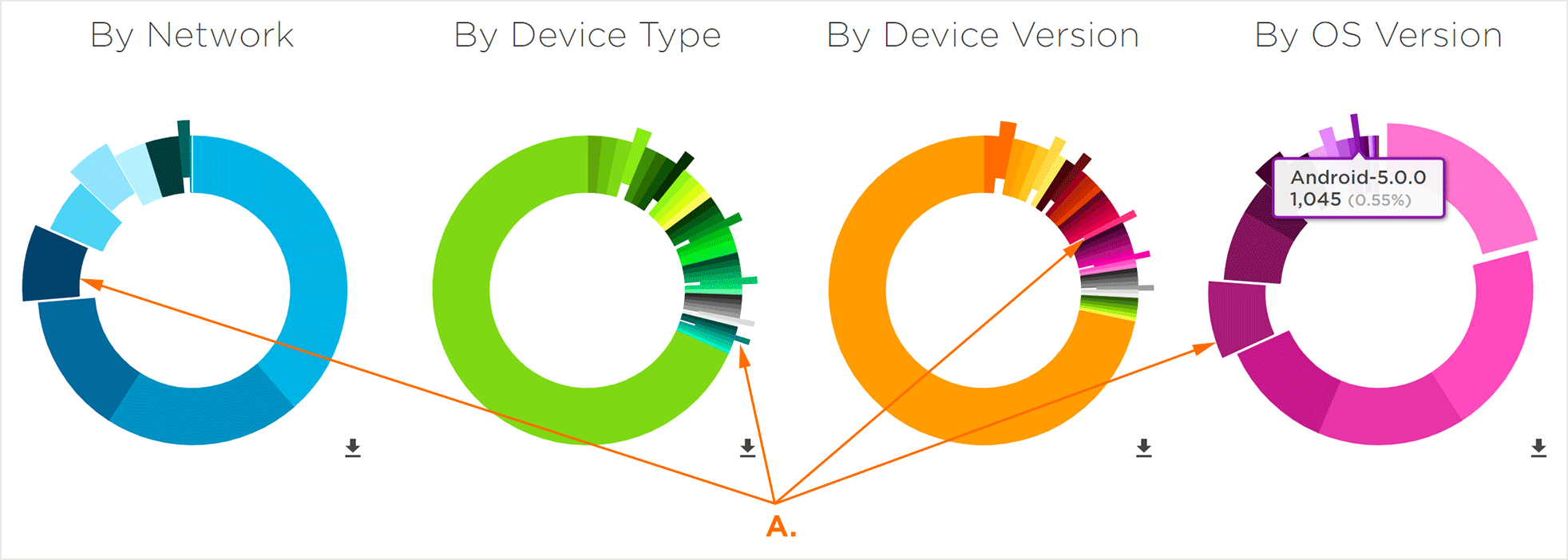
A. Click on sections for analysis and comparison
The data contained within each chart can also be viewed beneath the charts in alphanumeric form. Each instance displays the Section Title, Section Total and Percentage of the total the section represents. By default, the top three sections are displayed.
Click View More under any of the alphanumeric sections to expand the remainder of the data. Mousing over any of the data sets within the alphanumeric sections will highlight and display the section data within the donut chart. Click View Less under any of the alphanumeric sections to collapse the sections.
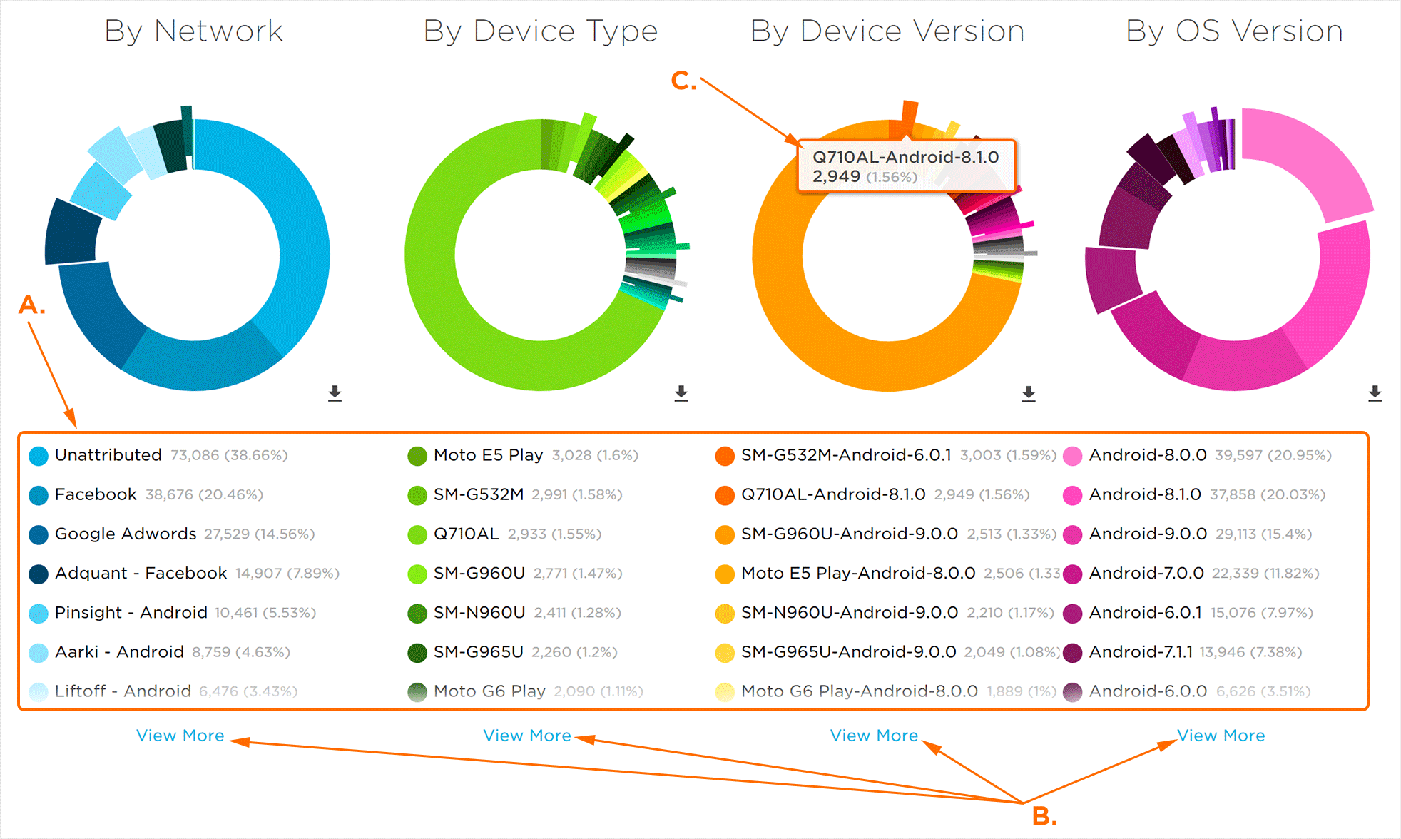
A. Alphanumeric Sections
B. Click one to display all alphanumeric data
C. Section highlighted by mousing over alphanumeric data
Within the alphanumeric sections, individual data sets can be disabled in order to refine the displayed donut charts. When a data set is disabled, a grey “X” will appear in place of the associated color.
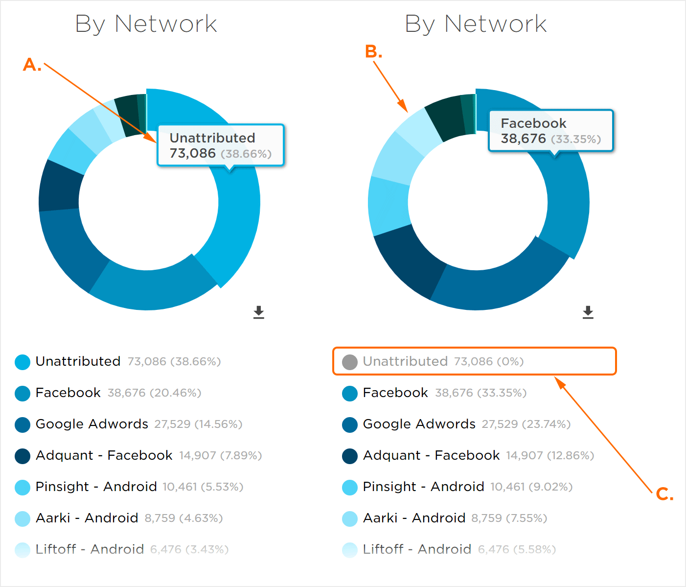
A. Fully displayed donut chart and alphanumeric sections
B. Donut chart adjusted with disabled data set
C. Disabled data set, data does not appear in donut chart
Downloading the Donut Chart Data
The data displayed within the donut charts and alphanumeric sections can be downloaded in the following formats:
Download Graphically:
Click the Download Button > Download Chart Image > Select a file format:
- PNG
- JPG
- SVG
Download Data:
Click the Download Button > Download Data > Select a file format:
- CSV
- XLSX
Print Data:
Click the Download Button > Print.