


The data in the retention analytics view is based on summary numbers to allow for reasonable render time and therefore have a statistical accuracy margin of 3-5%.
The Analytics Retention page provides a visualization of the retention of Installs, RPU (Revenue per User), Revenue, and events for a selected timeframe.
A. Graphic display of Retention data
A. Retention data organized into Campaigns
A. Interval from 1 Day to 30 Days
A. Date + 1 = Mar 28th
A. Percent Retained
A. Graph in Data format
Analytics Interface
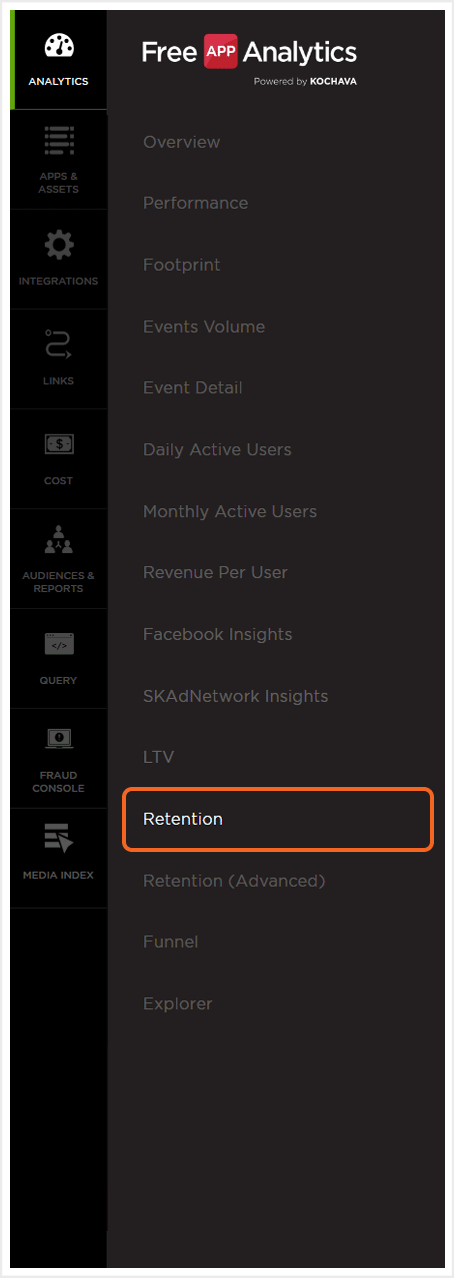
- Log in to Free App Analytics.
- Select the desired Account and App.
- Select Analytics > Retention.
Analytics Page Tools
For more information about the tools that can be used on the Analytics page such as date range, filters, sharing the page and exporting device ID, refer to our Analytics Page Tools support documentation.
NOTE: The Cohort Date set represents the end-date used to define the retention view.
Retention Chart Overview
The Retention chart is divided into 2 main sections, the dates within the selected time interval and the graphical display of retention in either data or chart form.
Mousing over any data blocks/chart within the display will show the Date, RPU, Revenue, and Events for the specific data block or chart.
NOTE: When leveraging Cross App functionality, the retention data for all apps within the App Name filter will be displayed. Retention data may be displayed for each app by utilizing the split by feature. For more information on viewing retention data by app, refer to the Retention Organization section. For more information about adding apps using the filter feature, refer to our Analytics Page Tools support documentation.
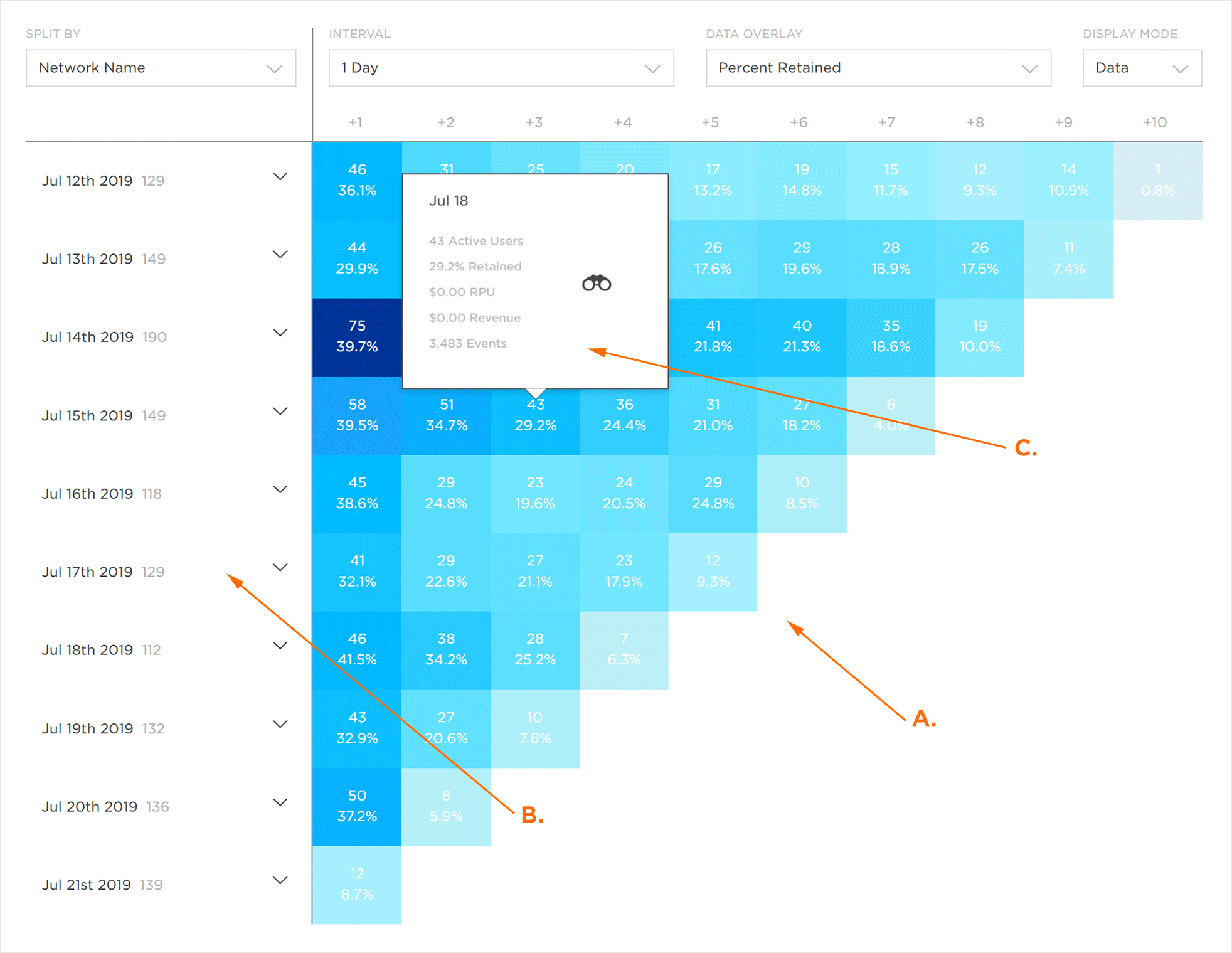
A. Graphic display of Retention data
B. Dates within timeframe
C. Mousover Data
NOTE: Data within the graphic display is color coordinated. The darker the color represents the higher the retention rate. The retention of each day (e.g., +1, +2, +3) is a subset of the initial install count and not a subset of the day prior.
Retention Organization
Retention data can be organized in many different ways in order to assist in the optimization of data visualization.
- From the Split By drop-down menu, Select one of the following:
- App
- Campaign
- Device
- Location
- Attribution
- Network Key
- Agency
- Traffic Verification
- Locate the desired date and click the Data Expand Button.
NOTE: In order to use the App split by feature, the desired apps must be added utilizing the filter feature. For more information about adding apps using the filter feature, refer to our Analytics Page Tools support documentation.
(see iOS 14+ restrictions)
NOTE: For more information about how the Partner fields map to SAN metadata, please refer to our SAN Networks Campaign Data Mapping support documentation.
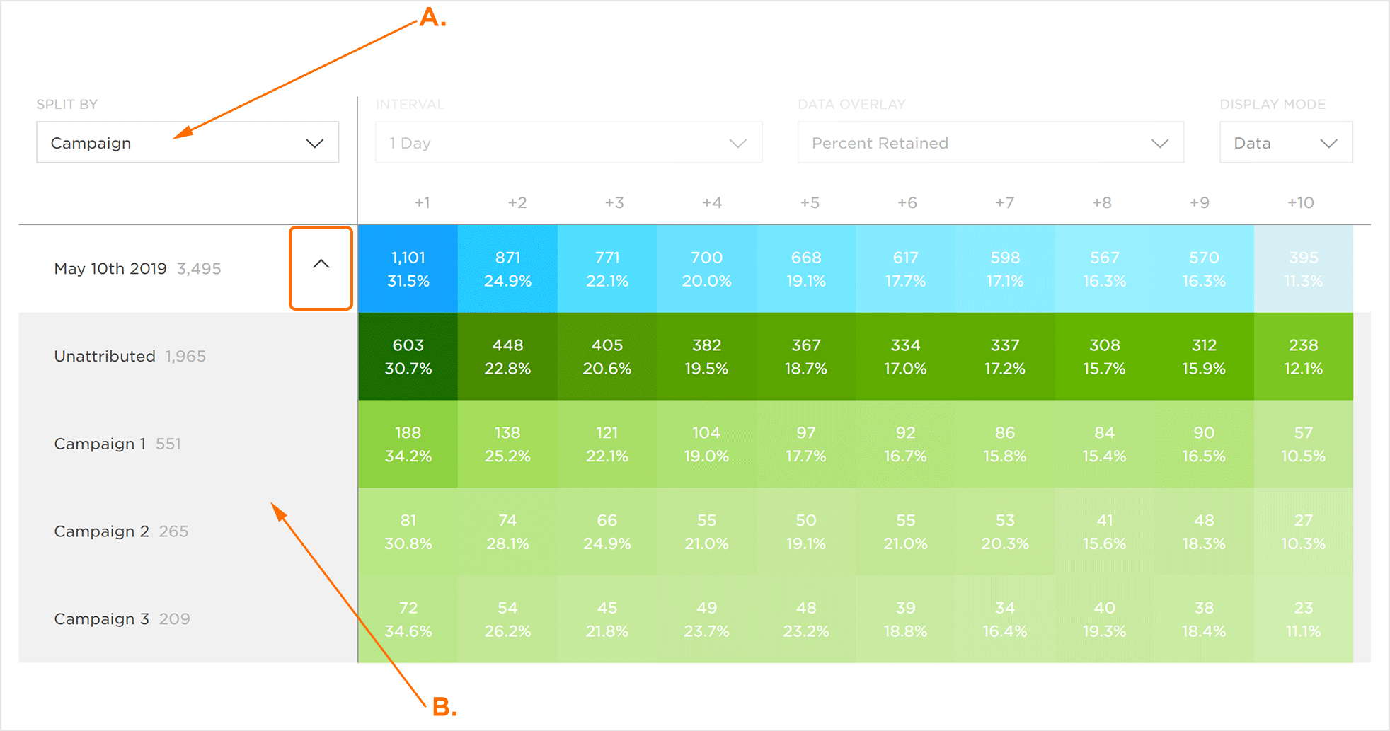
A. Retention data organized into Campaigns
B. Campaigns active during the selected timeframe
NOTE: Data within the graphic display is color coordinated. The darker the color represents the higher the retention rate.
Organize by Interval
The date intervals are displayed along with the Install Count for the corresponding date along the vertical axis. Date intervals can be updated by selecting one of the following from the Interval drop-down menu:
- 1 Day
- 7 Days
- 30 Days
NOTE: By default, the last fully completed day will be the start date for the data within the Retention Chart.
Ten dates will be displayed in the vertical axis which correspond to the selected interval. The earliest date within the selected timeframe is displayed at the top of the list and the final date within the timeframe is displayed at the bottom of the list.
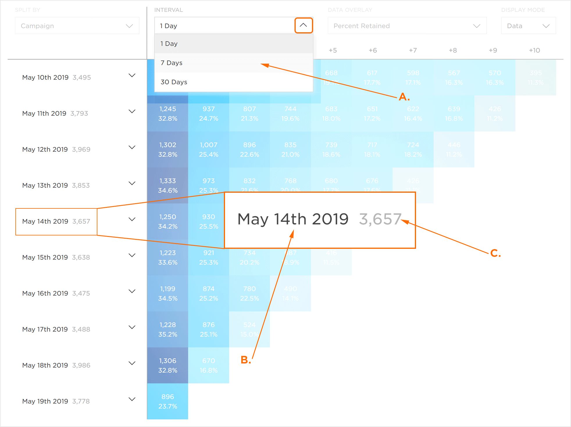
A. Interval from 1 Day to 30 Days
B. Date within the selected time interval
C. Install Count for day
The date interval is also represented along the horizontal axis at the top of the graphical display section corresponding to the selected interval (i.e. 1, 7 or 30).
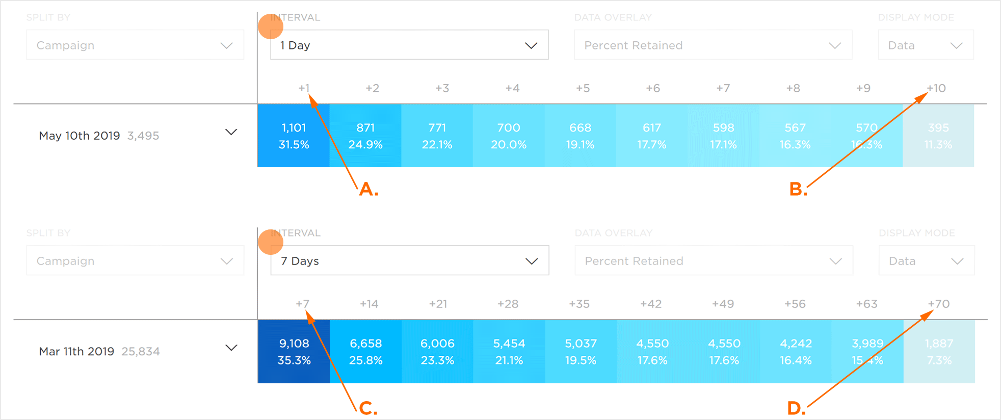
A. Date + 1 = Mar 28th
B. Date + 10 = Apr 6th
C. Date +7 = Feb 3rd
D. Date +70 = Apr 6th
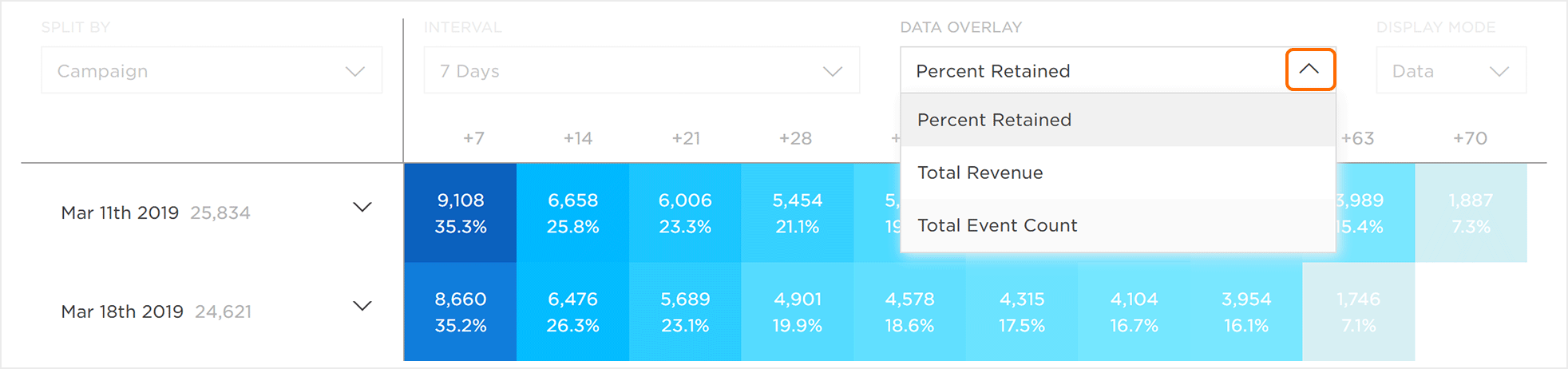
Data Overlay
The data that is shown within the graphic display may be updated to illustrate the different aspects of the retention within the app. The data displayed may be updated by selecting one of the following:
Data Overlay Drop-Down Menu:
- Revenue Per User
- Total Revenue
- Total Event Count
NOTE: By default, the retained Install Count and the associated percentage are displayed. When selecting one of the available overlays, the retained Install Count will remain.
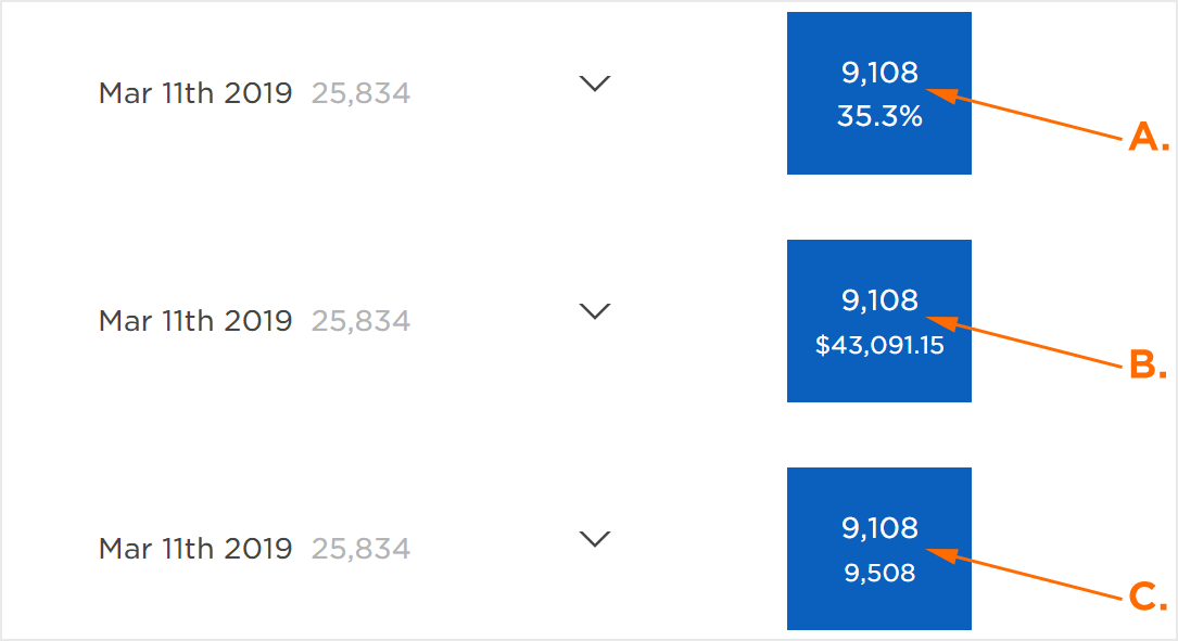
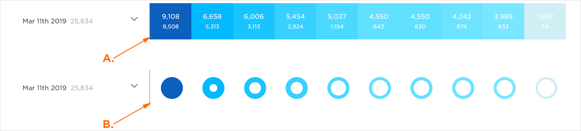
A. Percent Retained
B. C. Total Revenue Overlay: Install count and Revenue for day
D. Total Event Count Overlay: Install count and Events for day
Display Mode
The graphical display section can be shown in different formats. To change the format of the data displayed within the graphical display, select one of the following from the Display Mode drop-down menu:
- Data
- Chart
NOTE: The color indicates active users. The darker the color, the higher the number of active users.
NOTE: The size of the hole within the donut chart indicates the selected overlay. For example, if the Total Revenue overlay is selected, the size of the hole indicates the amount of revenue. The smaller the hole, the higher the amount of revenue.
NOTE: By default, the data within the graphic display section is shown in the Data format.
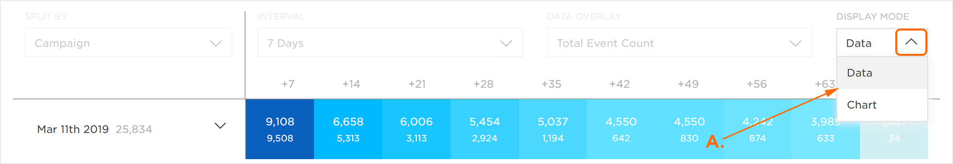
A. Display in either Data or Chart format