This feature is available only with paid Kochava accounts. Contact us to learn more.
We highly recommend checking your Kochava tracking links to ensure that the below keys are included exactly as below. This is necessary for us to join your Cost data to Measurement data.
- partner_campaign_id = the network partner’s campaign ID.
- partner_campaign_name = not required, but is human-readable and useful to have on measurement data.
- creative_Id = required for joining cost to measurement data at the creative level – EITHER the creative_id or creative_name can be passed here, so long as it is available from the network in cost data to join – AND doesn’t change mid-campaign.
Example: partner_campaign_id={partner macro here}
NOTE: When creating each network API integration, we review the click and impression templates on file with Kochava to ensure as best we can that the above parameters are included. However, it is possible that not all partners have made necessary updates – or the links were adjusted manually prior to trafficking – and double checking is highly recommended. If you need help verifying in-flight trackers, please contact your CSM team for assistance. They can help you identify network partners where these values may be missing.
NOTE: It is OK to have these values added more than once under different keys. For example, if you are sending partner_campaign_id under cp_2={partner_campaign_id}, for example, you can keep doing that but will be required to add the same value under the partner_campaign_id key.
Example: Your links could contain both —
control.kochava.com/v1/cpi/click?campaign_id=12345&cp_2={partner_campaign_id}&partner_campaign_id={partner_campaign_id}
Lifetime Value (LTV) calculations vary in terms of how they are calculated across industries and advertisers. To solve for this, we have created a standard event called “LTV” that can be sent to Kochava at any interval that makes sense for the advertiser. Include the LTV value in the event_data section. (e.g., event_name -> “LTV” and event_value -> “$4.56”).
Our Measurement Explorer will look for an event called “LTV” and collect the last value sent and display the event_value as sent on the event. This allows our system to display the sum of user LTV across available dimensions for the most recent value received.
NOTE: To utilize our standard LTV calculations using the Ad View event over 1, 7, 14, or 30 day timeframe, please refer to the current LTV support documentation for the Analytics – LTV page.
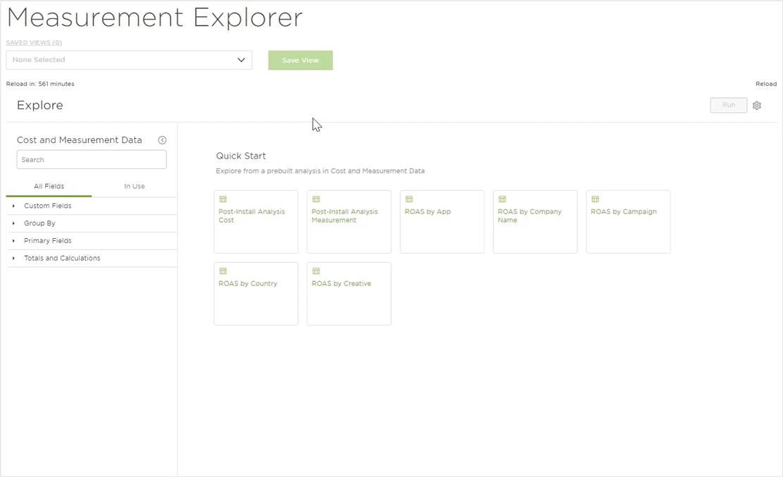
When the Measurement Explorer view is first loaded, the user is provided with the option of clicking on 7 Quick Start options to quickly jump into the data:
Quick Start Views:
Enables the viewing of cost-reported traffic, conversions, and (measurement) post-install event data split by network name and campaign name.
By default when the Post-Install Analysis Cost visual is selected the following fields are loaded:
Primary Fields —
- Company Network Name
- Partner Campaign Name(s)
Totals and Calculations —
- Click Through Rate Cost
- Clicks Cost
- Conversion Rate Cost
- Events Retention and Revenue
- Impressions Cost
- Installs Cost
- Revenue USD
- ROAS
- Spend USD
Enables the viewing of measurement-reported traffic, conversions and post-install event data split by network name and campaign name.
By default when the Post-Install Analysis Measurement visual is selected the following fields are loaded:
Primary Fields —
- Company Network Name
- Partner Campaign Names
Totals and Calculations —
- Click Through Rate Measurement
- Clicks Measurement
- Conversion Rate Measurement
- Events Retention, Revenue
- Impressions Measurement
- Installs Measurement
- Revenue USD
- ROAS
- Spend USD
Enables the viewing of Return on Ad Spend and send split by app name.
By default when the ROAS by App visual is selected the following fields are loaded:
Primary Fields —
- App Name
Totals and Calculations —
- Revenue USD
- ROAS
- Spend USD
Enables the viewing of Return on Ad Spend and send split by company name.
By default when the ROAS by Company visual is selected the following fields are loaded:
Primary Fields —
- Company Network Name
Totals and Calculations —
- Revenue USD
- ROAS
- Spend USD
Enables the viewing of Return on Ad Spend and send split by company and campaign name.
By default when the ROAS by Campaign visual is selected the following fields are loaded:
Primary Fields —
- Company Network Name
- Partner Campaign Name(s)
Totals and Calculations —
- Revenue USD
- ROAS
- Spend USD
Enables the viewing of Return on Ad Spend and send split by country.
By default when the ROAS by Country visual is selected the following fields are loaded:
Group By —
- Country
Primary Fields —
- Company Network Name
- Country
Totals and Calculations —
- Revenue USD
- ROAS
- Spend USD
Enables the viewing of Return on Ad Spend and send split by country and creative.
By default when the ROAS by Creative visual is selected the following fields are loaded:
Group By —
- Country
- Creative
Primary Fields —
- Company Network Name
- Creative
Totals and Calculations —
- Revenue USD
- ROAS
- Spend USD
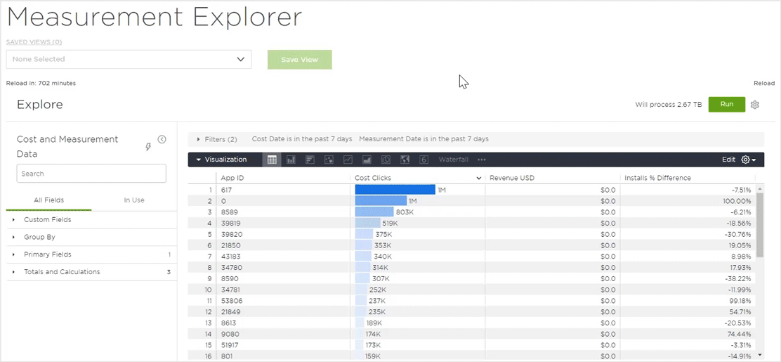
The Cost Explorer is divided into three main sections:
The first is a field control section on the left side for selecting available dimensions and measures. The field control has a search bar and an All Fields and In Use tabs for selecting or deselecting dimensions, measures, pivots and filters.
The second section is the center portion of the screen with a tab for Filters, Visualization and Data that have been selected in the field control and can easily be expanded or contracted as needed.
NOTE: The currency filter does not provide any drop-down options. The user will needs to enter the 3 digit currency code (upper/lower case allowed) and click run. For a full list of currencies supported by Kochava, refer to our Cost Overview support documentation.
The third is the top section where you can find the Save View feature, Run button to refresh the results after adding new dimensions or measures, and a gear wheel menu.
Field Control
The Field Control section provides the ability to easily add or remove any of the available fields. There are two tabs within the section, All Fields provides the full list of fields available for selection and In Use provides the list of fields that are currently selected. When a field has been added or removed, the Cost graphic display will be updated. Below is a list of the available fields for selection.
Features:
The Field Control section provides robust features allowing users to easily locate, select or remove fields for analysis.
Search —
The field search box provides a convenient method for locating specific fields. Typing part of all of the field name will filter all of the available fields to display only the fields that match the query.
Selecting/Removing Fields —
Once a field has been located with the list of fields, click on it to add the field. Clicking on a selected field will remove that field from the list and the graphic display will be updated.
Clearing Fields —
All selected fields may be cleared. Under In Use click Clear all.
Collapsing Fields Menu —
In order to maximize the graphic display, the Fields menu may be collapsed by clicking on the collapse button.
Quick Start Reload —
At any point, the Quick Start prebuilt analysis may be loaded. Click on the lightning bolt icon and select from one of the prebuilt analysis. If any filtering has been selected, you will be presented with an option to either keep the current filters or replace them with the new filters associated with the prebuilt analysis.
Group By —
The Group by dimensions are required whenever you are selecting the “Country” or “Creative” dimensions in the Primary Fields. As not all partners provide Country or Creative data, this will allow for increased or decreased granularity as needed.
NOTE: If the Group by dimension is not selected, the data will display as ungrouped_country or ungrouped_creative. Simply toggle on the Group by for the desired dimension and click Run.
Country (Yes/No)
Creative (Yes/No)
App
- ID
- Name
- Platform
Company Name
- ID
- Name
Country
Creative
- ID
- Name
Partner Campaign
- Key
- Name(s)
Click Through Rate
- % Difference
- Cost
- Measurement
Clicks
- % Difference
- Cost
- Difference
- Measurement
Conversion Rate
- % Difference
- Cost
- Measurement
Cost Per Click
- % Difference
- Cost
- Measurement
Cost Per Event
- Retention
- Revenue
- Total
Cost Per Install
- % Difference
- Cost
- Measurement
Cost Per Mille
- % Difference
- Cost
- Measurement
Events
- Retention
- Revenue
- Total
Gross Margin
Impressions
- % Difference
- Cost
- Difference
- Measurement
Installs
- % Difference
- Cost
- Difference
- Measurement
Installs Per Mille
- % Difference
- Cost
- Measurement
LTV
Revenue USD
ROAS
Spend USD
Graphic Display
The Graphic Display section provides a multitude of way to graphically display the data associated with the selected fields.
Available Visualizations:
- Table – Displays the associated data within a table format.
- Column – Displays the associated data within a column graph.
- Bar – Displays the associated data within a bar graph.
- Scatterplot – Displays the associated data within a scatterplot graph.
- Line – Displays the associated data within a line graph.
- Area – Displays the associated data within an area chart.
- Pie – Displays the associated data within a pie chart.
- Map – Displays the associated data within a world map.
- Single Value – Displays the top data value returned.
- Boxplot – Displays the associated data within a box graph.
- Donut Multiples – Displays the selected totals metric within a single donut chart.
- Funnel – Displays the associated data within a Funnel chart.
- Sankey – Displays the selected dimensions within a Sankey chart.
- Single Record – Displays a single record of the selected metrics.
- Static Map (Points) –
- Static Map (Regions) – Displays the associated data on a regional map.
- Table (Legacy) – Displays the associated data within a standard table format.
- Timeline – Displays the associated data along a timeline.
- Waterfall – Displays the associated data within a waterfall graph.
- Word Cloud – Displays a collection of words depicted in different sizes based upon the associated data.
Kochava Suggested Views:
Kochava’s Measurement Explorer contains many different way to view your data. The following views are the most commonly used and most recommended by Kochava for easily viewing your data.
The Column visualization provides a convenient way to compare the field totals within a vertical column graph. The vertical and horizontal axis will display the associated data depending on the fields selected. Each selected metric will be represented by a different colored column and mousing over any of the columns will display the associated totals.
The metrics displayed in the graph can be enabled/disabled in order to refine the display.
The edit feature provides the opportunity to update various aspects of the column graphic display such as how the data is positioned, column spacing, column colors, label settings as well as various settings for the X and Y axis.
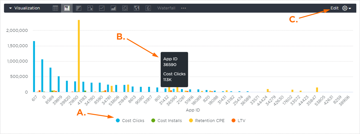
A. Enable/Disable metrics.
B. Mouseover data.
C. Edit Feature.
The Bar visualization provides a convenient way to compare the field totals within a horizontal column graph. The vertical and horizontal axis will display the associated metrics depending on the fields selected. Each selected metric will be represented by a different colored column and mousing over any of the columns will display the associated totals.
Metrics displayed in the graph can be enabled/disabled in order to refine the display.
The edit feature provides the opportunity to update various aspects of the column graphic display such as how the data is positioned, column spacing, column colors, label settings as well as various settings for the X and Y axis.
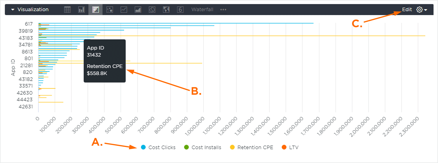
A. Enable/Disable Metrics.
B. Mouseover Data.
C. Edit Feature.
The Line visualization provides a convenient way to compare the field totals with a plotted line displaying how the totals changed over the selected metrics. The vertical or horizontal axis will display the associated totals depending on the view selected. Each metric line will be represented by a different color and mousing over any of the lines will display the associated totals.
Metrics displayed in the graph can be enabled/disabled in order to refine the display.
The edit feature provides the opportunity to update various aspects of the line graphic display such as how the data is positioned, line spacing, line colors, label settings as well as various settings for the X and Y axis.
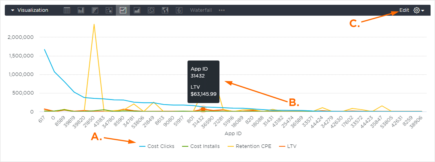
A. Enable/Disable Metrics.
B. Mouseover Data.
C. Edit Feature.
The Map visualization provides a heatmap displayed over a world map. Lighter green represents the lowest value, while darker red indicated the highest values.
The map can be zoomed in by clicking on the “+” sign or zoomed out by clicking on the “-” sign. The map can also be moved by clicking and holding the mouse and then moving the map in the desired direction and clicking on a country will display the associated data.
The edit feature provides the opportunity to update various aspects of the map graphic display such as displaying gridlines for each region, the map style, the map scale indicator and the value colors.

A. Data Density Index.
B. Country Data.
C. Edit Feature.
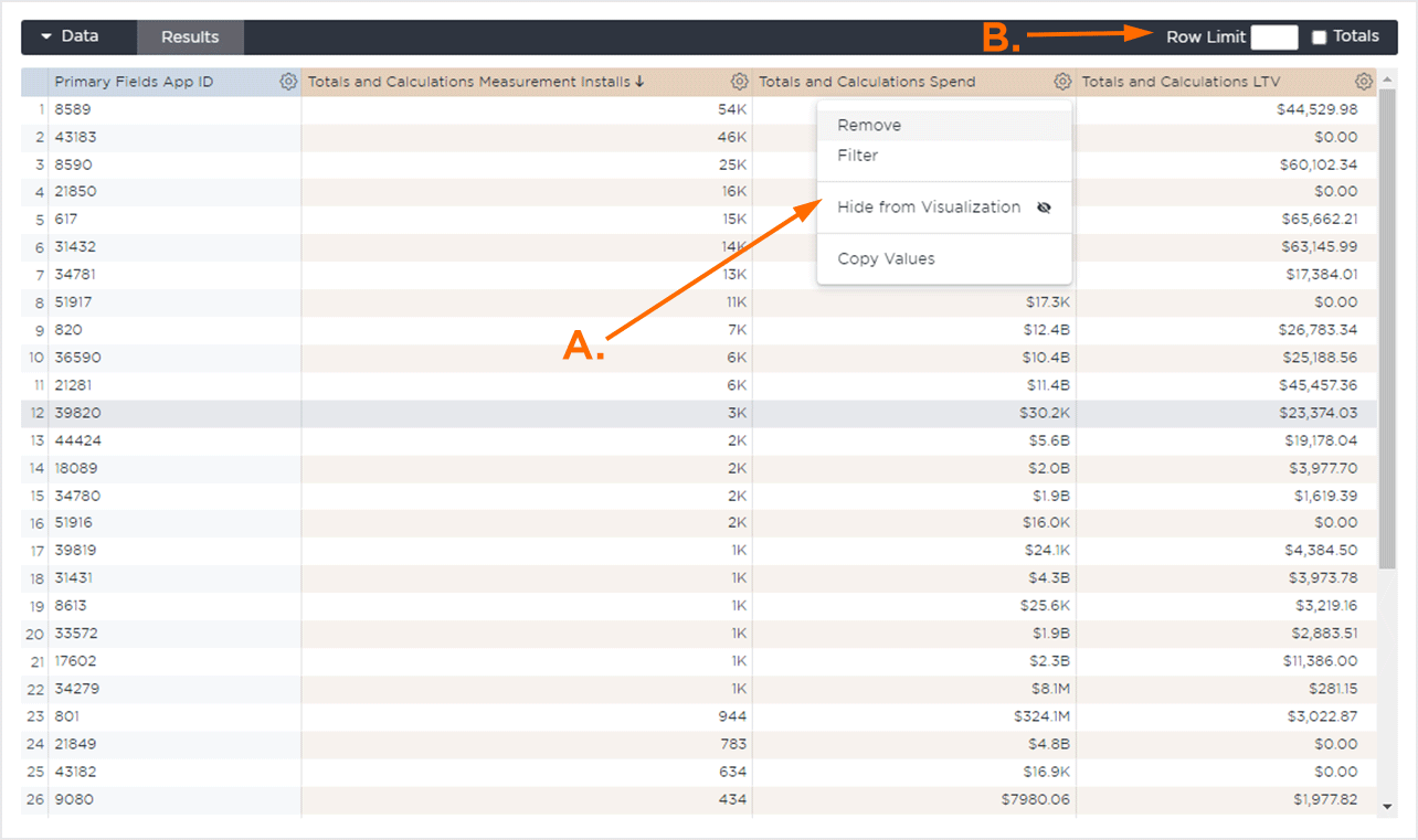
Spreadsheet Display
The Spreadsheet display provides an in-depth view of the data associated with the selected quick view or custom view. Depending on the view or fields selected, the data will be pivoted on different fields and the number of columns present will vary.
Data can be filtered, organized and the number of rows can be set in order to optimize the display. Column and Row totals may also be available to be displayed depending on the view.
The columns will be added in the order in which they are clicked on in the Field Control section. They can be reordered by clicking on the desired column and dragging into a new position within the spreadsheet view.