This feature is available only with paid Kochava accounts. Contact us to learn more.
When the SKAdNetwork Explorer view is first loaded, the user is provided with the option of clicking on four Quick Start options to quickly jump into the data:
- SKAdNetwork Install Match Type — Enables the viewing of installs and spend by SKAdNetwork Match Type.
- SKAdNetwork Reinstall Percentage — Enables the viewing of SKAdNetwork reinstalls and spend.
- Cost vs. SKAdNetwork Review — Enables the viewing of cost-collected data alongside SKAdNetwork data.
- SKAdNetwork Influencer Review — Enables the viewing of click and impression influencers alongside SKAdNetwork install data and spend.
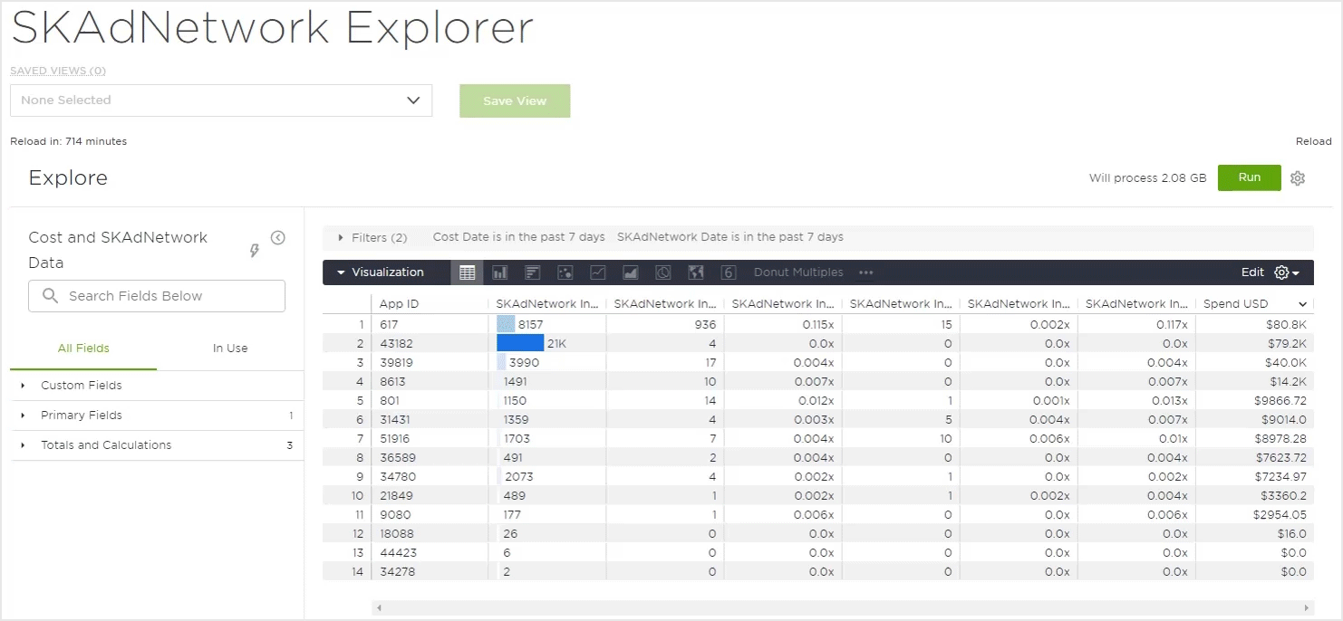
The SKAdNetwork Explorer is divided into three main sections:
The first is a field control section on the left side for selecting available dimensions and measures. The field control has a search bar and an All Fields and In Use tabs for selecting or deselecting dimensions, measures, pivots and filters.
The second section is the center portion of the screen with a tab for Filters, Visualization and Data that have been selected in the field control and can easily be expanded or contracted as needed.
NOTE: The currency filter does not provide any drop-down options. The user will needs to enter the 3 digit currency code (upper/lower case allowed) and click run. For a full list of currencies supported by Kochava, refer to our Cost Overview support documentation.
The third is the top section where you can find the Save View feature, Run button to refresh the results after adding new dimensions or measures, and a gear wheel menu.
Quick Start Views
SKAdNetwork Install Match Type:
By default when the SKAdNetwork Install Match Type visual is selected the following fields are loaded:
- Primary Fields — Partner Campaign Name(s)
- Totals and Calculations — SKAdNetwork Installs, SKAdNetwork Match Type (% Click, % Impression, Click, Impression), Spend USD
SKAdNetwork Reinstall Percentage:
By default when the SKAdNetwork Reinstall Percentage visual is selected the following fields are loaded:
- Primary Fields — Partner Campaign Name(s)
- Totals and Calculations — SKAdNetwork Installs, SKAdNetwork Reinstalls (% Reinstalls, SKAdNetwork Reinstalls), Spend USD
Cost vs. SKAdNetwork Review:
By default when the Cost vs. SKAdNetwork Review visual is selected the following fields are loaded:
- Primary Fields — Partner Campaign Name(s)
- Totals and Calculations — Click Through Rate Cost, Clicks Cost, Conversion Rate (Cost, SKAdNetwork), Cost Per Install (Cost, SKAdNetwork), Impressions Cost, Installs (Cost, SKAdNetwork), Spend USD
SKAdNetwork Influencer Review:
By default when the SKAdNetwork Influencer Review visual is selected the following fields are loaded:
- Primary Fields — Partner Campaign Name(s)
- Totals and Calculations — Installs SKAdNetwork, SKAdNetwork Influencers (Click, Impression, Ration – All, Ratio – Click, Ration – Impression), Spend USD
Field Control
The Field Control section provides the ability to easily add or remove any of the available fields. There are two tabs within the section, All Fields provides the full list of fields available for selection and In Use provides the list of fields that are currently selected. When a field has been added or removed, the SKAdNetwork Explorer graphic display will be updated. Below is a list of the available fields for selection.
Features:
The Field Control section provides robust features allowing users to easily locate, select or remove fields for analysis.
Search —
The field search box provides a convenient method for locating specific fields. Typing part of all of the field name will filter all of the available fields to display only the fields that match the query.
Selecting/Removing Fields —
Once a field has been located with the list of fields, click on it to add the field. Clicking on a selected field will remove that field from the list and the graphic display will be updated.
Clearing Fields —
All selected fields may be cleared. Under In Use click Clear all.
Collapsing Fields Menu —
In order to maximize the graphic display, the Fields menu may be collapsed by clicking on the collapse button.
Quick Start Reload —
At any point, the Quick Start prebuilt analysis may be loaded. Click on the lightning bolt icon and select from one of the prebuilt analysis. If any filtering has been selected, you will be presented with an option to either keep the current filters or replace them with the new filters associated with the prebuilt analysis.
App
- ID
- Name
Company Name
- ID
- Name
Partner Calculations
- Key
- Name(s)
Click Through Rate
- Cost
Clicks
- Cost
Conversion Rate
- Cost
- SKAdNetwork
Cost Per Click
- Cost
Cost Per Install
- Cost
- SKAdNetwork
Cost Per Mille
- Cost
Impressions
- Cost
Installs
- Cost
- SKAdNetwork
Installs Per Mille
- Cost
SKAdNetwork Influencers
- Click
- Impression
- Ratio – All
- Ratio – Click
- Ratio – Impression
SKAdNetwork Match Type
- % Click
- % Impression
- Click
- Impression
SKAdNetwork Reinstalls
- % Reinstalls
- SKAdNetwork Reinstalls
Spend USD
Graphic Display
The Graphic Display provides a multitude of ways to graphically display the data associated with the selected fields.
Available Visualizations:
- Table – Displays the associated data within a table format.
- Column – Displays the associated data within a column graph.
- Bar – Displays the associated data within a bar graph.
- Scatterplot – Displays the associated data within a scatterplot graph.
- Line – Displays the associated data within a line graph.
- Area – Displays the associated data within an area chart.
- Pie – Displays the associated data within a pie chart.
- Map – Displays the associated data within a world map.
- Single Value – Displays the top data value returned.
- Boxplot – Displays the associated data within a box graph.
- Donut Multiples – Displays the selected totals metric within a single donut chart.
- Funnel – Displays the associated data within a Funnel chart.
- Sankey – Displays the selected dimensions within a Sankey chart.
- Single Record – Displays a single record of the selected metrics.
- Static Map (Points) –
- Static Map (Regions) – Displays the associated data on a regional map.
- Table (Legacy) – Displays the associated data within a standard table format.
- Timeline – Displays the associated data along a timeline.
- Waterfall – Displays the associated data within a waterfall graph.
- Word Cloud – Displays a collection of words depicted in different sizes based upon the associated data.
Kochava Suggested Views:
Kochava’s Cost Explorer contains many different way to view your cost data. The following views are the most commonly used and most recommended by Kochava for easily viewing your data.
The Column visualization provides a convenient way to compare the field totals within a vertical column graph. The vertical and horizontal axis will display the associated totals depending on the view selected. Each selected Total metric will be represented by a different colored column and mousing over any of the columns will display the associated totals.
By default, data is displayed for the previous 7 days. The metrics displayed in the graph can be enabled/disabled in order to refine the display.
The edit feature provides the opportunity to update various aspects of the column graphic display such as how the data is positioned, column spacing, column colors, label settings as well as various settings for the X and Y axis.
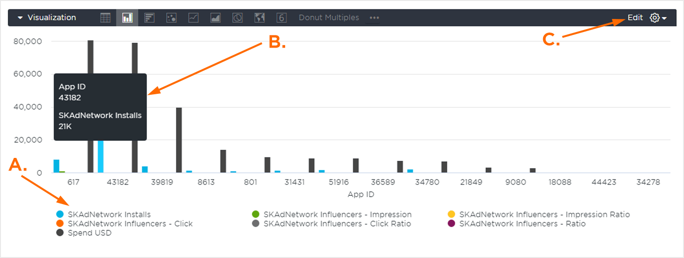
A. Enable/Disable metrics.
B. Mouseover data.
C. Edit Feature.
The Bar visualization provides a convenient way to compare the field totals within a horizontal column graph. The vertical and horizontal axis will display the associated totals depending on the view selected. Each selected Total metric will be represented by a different colored column and mousing over any of the columns will display the associated totals.
By default, data is displayed for the previous 7 days. Metrics displayed in the graph can be enabled/disabled in order to refine the display.
The edit feature provides the opportunity to update various aspects of the column graphic display such as how the data is positioned, column spacing, column colors, label settings as well as various settings for the X and Y axis.
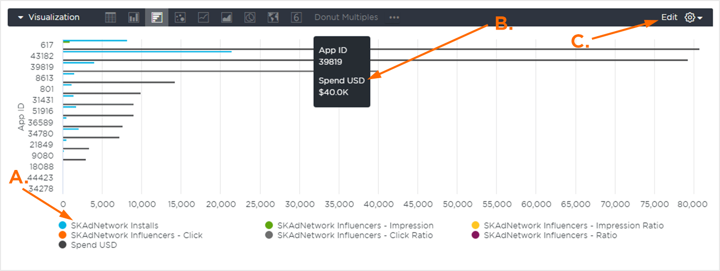
A. Enable/Disable Metrics.
B. Mouseover Data.
C. Edit Feature.
The Line visualization provides a convenient way to compare the field totals with a plotted line displaying how the totals changed over time. The vertical and horizontal axis will display the associated totals depending on the view selected. Each metric line will be represented by a different color and mousing over any of the lines will display the associated totals.
By default, data is displayed for the previous 7 days. Metrics displayed in the graph can be enabled/disabled in order to refine the display.
The edit feature provides the opportunity to update various aspects of the line graphic display such as how the data is positioned, line spacing, line colors, label settings as well as various settings for the X and Y axis.
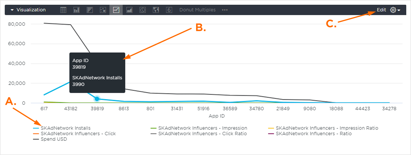
A. Enable/Disable Metrics.
B. Mouseover Data.
C. Edit Feature.
The Donut Multiples graph provides a visualization for each primary field (i.e., App ID, Partner Campaign Name) segmented into the selected Total and Calculations fields.
Mousing over each part of a Donut graph will display the associated segment’s data.
The edit feature provides the opportunity to update various aspects of the map graphic display such as the label size, the number of charts per row and the value colors.
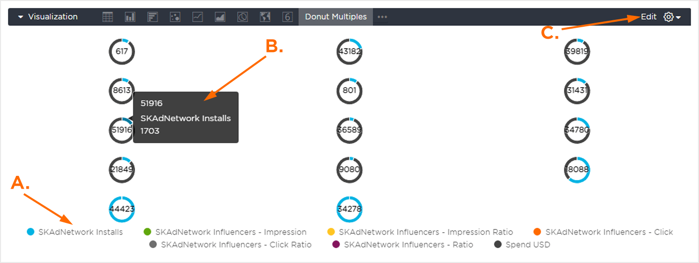
A. Enable/Disable Metrics.
B. Mouseover Data.
C. Edit Feature.
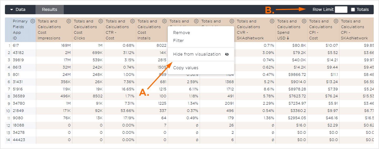
Spreadsheet Display
The Spreadsheet display provides an in-depth view of the data associated with the selected quick view or custom view. Depending on the view or fields selected, the data will be pivoted on different fields and the number of columns present will vary.
Data can be filtered, organized and the number of rows can be set in order to optimize the display. Column and Row totals may also be available to be displayed depending on the view.
The columns will be added in the order in which they are clicked on in the Field Control section. They can be reordered by clicking on the desired column and dragging into a new position within the spreadsheet view.